
The Creative Process of Making a Logo
Erica Lahaie
Hello, hi! I'm Eric, one of the artists here at Cardboard Utopia. You might notice something pretty neat right now—which is that our logo has changed! Oh, boy!
You might be asking yourself some questions about it. Why that logo? What happened to the old one? Did you have any other ideas for a logo? Should I invest in a house right now? If not now, then when?
Firstly, don't buy a house. Rent forever and when that turns sour, transform one of your bookcases into a boat and sail the seven seas. If you don't have a bookcase, you can use your bed. Won't be as poetic, though.
Actually don't listen to my advice, I barely even know what a mortgage is. What I do know, however, is the process we took to make our new logo because I done drew that thing. I thought I'd give y'all a cool little insight into the process, see what goes on in the mind of a designer/artist personman when coming up with this stuff.
Before any actual designing started, I set a goal: to have a somewhat neutral identity, as to not tie ourselves down to a specific type of game, style, or attitude. You can come up with some really cool logos if you have a very, very specific identity in mind but we have a really broad approach to the types of games we want to make, however, so we opted to go for something... 'generic', let's say. Probably more negative of a term than I'd like to use but hey, that's why I do art and not words.
As I started to sketch out ideas, I started to realise we had a bit of a problem: the company name. A reference to Kijong-dong, North Korea's infamous Propaganda Village near the 38th parallel, Cardboard Utopia is a somewhat specific set of words that makes it a bit difficult to go "neutral". I wanted to make an effort to break away from the name's descriptive nature because it's easy to just make it look like cardboard or something similar. Whatever was the first idea I had, I couldn't use that because it's the most obvious one and the obvious idea is never the good idea. That said, I still explored some more name-related ideas for the sake of variety. Maybe I'd come up with something cool!
Here are some of the more advanced ideas I came up with after initial sketches.

Here's our former logo. So, what's wrong with it? Well, for one, the "This Side Up" arrow is pointing downwards so we already done goofed.
But it's also... not really a logo. It's an illustration, something we kind of always meant to be a placeholder. A logo should be something we can easily turn into a black and white design to put on t-shirts or something and this... just isn't it.

Frankly, there's not much behind this other than me just kinda liking the filled in letters, the color, and the strikethrough styling. I've never been a designer or artist that's really followed common design philosophies—though modern graphic design is something I adore to no end. I've always just kinda done what I thought looked cool and... well, I think it's worked pretty well so far.
Still, there was something about this that didn't sit entirely right with me so I moved on.

Nah. Too sterile. Military-like. I like the look of it in a way and tried to get the "pieced together" look of cardboard but it's not the direction I was looking for.

This was me sticking way too close to the name. I love the way this looks, I think it's super cute and fun, but not only is it a near-literal representation of the name but it's also pretty 'fun'. There's a company out there that this might be thematically perfect for them but I just don't think it's us.

After I made the above logo, I started trying less to work the name into the imagery.
I actually really like the look of this but I couldn't go further with it because I know it's similar to a logo I've seen somewhere else. I can't remember if it's a game, or a company, or whatever. I've just seen that treatment done before and I can't remember where and it drives me nuts.

I like the look of it and how it uses cardboard-like colors but I couldn't set aside how much it reminded me of like... Animal Crossing or Professor Layton or something. It made me think it was the logo to a Level-5 game. Moving on!

I'm pretty sure I had some form of inspiration for this but I can't say I remember it. All I know is that I like the look of it and the idea was that it would reflect light from left to right whenever the logo appeared. Cool 80s-type thing.
Looks a bit too plain, though.

This is a severely unexplored idea but I wanted to see what I could do with a propaganda poster-like style. I think it's cool! Looks weird for a logo, though. There's probably something to this but my moment with it had passed and I moved onto something else.

This is probably the logo that saw the most iteration. The idea was simple: put Kijong-dong inside a cardboard box.
And you know what? I love this design. I think it's great. It's simple, it's clean, (not counting the grime) and it's neutral.
The problem... is that it's kinda too neutral. The more we looked at it, the more we thought it just didn't fit with us. Jason thought it looked a bit too much like a car license plate (accurate) and I couldn't find a font that gave it less of a stern look to it. No matter how much I messed with the design, I just couldn't settle on something.

I tried messing with different compositions, colors, and variants. Nothing stuck. I loved everything I came up with but, at the same time, didn't think any of it worked. I tried asking some friends (Thank you, Cal!) for feedback and even with that, and subsequently incorporating it, I just couldn't find something I thought was more fitting of how we want to present ourselves as.
It bums me out because, like I said, I really like that logo. It's just not meant to be. If you've got a company that makes outdoor wear or boots or steel girders or something though, gimme a shout, yeah?
That logo would drive me nuts. I just couldn't get it right, so I thought "fuck it" and went for something that just trashed the "Cardboard" and "Utopia" idea altogether. "What if," I thought, "we just went with something that was just super-neutral but still evocative of the type of games we want to make and what inspired them.
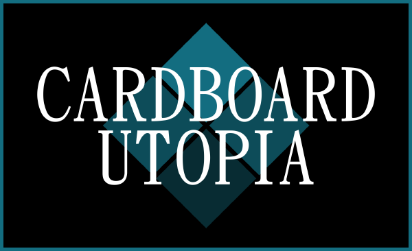
After spending a wicked-long amount of time on logos, we settled on this. It in no way has anything to do with cardboard or utopias or North Korea and, you know what? That's cool. Because we all thought it was cool. It clicked with us and that's what was most important. You could spend $237,000 on a Lamborghini Huracan but if you feel way more in synch with a $32,000 Honda S2000 then that's what counts, right?
... My true colors are showing, aren't they.
I think what got us to like the logo so much is that it looks decidedly 90s. Like an old tech company or something. "That's rad," we thought to ourselves. "It looks like the logo a company would rebrand itself to at the height of its mid-90s success," Jason said. "Oh my gosh, finally. I can move onto something else instead of busting my head against logos for a day and a half," I silently thought in my head which I've now put into words her—whoops. I spent nearly all of my art and design education having to come up with a meaningful reasoning for why I did the projects I did. "Why is this like that? What does it say? What does it mean to you?" I don't know, man! I just want to make cool things! Why can't I just do that? Why can't we just do that?
Much like how we want to approach our games, we decided on the new Cardboard Utopia because it looks cool, and we're way okay with that. Though we have a clear and meaningful approach to how we want to make games, we ultimately just want to make cool things. Taking that super-simple ethos to how we present ourselves is a great way of communicating that.
I suppose it doesn't hurt that the PS1/Saturn era is the cycle we all connect with the most, either.
So that's pretty much what I did for 12-or-so hours, along with the thoughts that processed through our minds while doing so. Hope you enjoyed peeking into the design process and I look forward to sharing more of that cool stuff with you all! Be sure to let us know in the comments what you thought! (Or if you thought we're insane and should have gone with flying toast or something as an identity.)